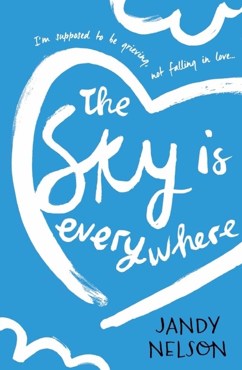
I remember seeing The Selection all over the internet and fell in love with the covers, the pretty dresses and perfect colours. If I hadn't seen the covers everywhere, it could have taken a lot longer for me to pick the series up.
I appreciate books that are beautiful inside and out. With this series "Judge This Book by its Cover" I want to basically fangirl at the work of book cover designers everywhere.
I'm going to kick it off with I'll Give You The Sun by Jandy Nelson. This book is without a doubt one of the most beautifully written books I've ever read. I had high expectations after The Sky is Everywhere and it exceeded them. So, let's take a look at the cover.
UK
US
As much as I love my copy, I do really like the US cover. It's got the same sun-like design but less obvious. It doesn't hint at the huge part art plays in the novel as much, but the colours do a good job of indicating how vibrant the novel is in terms of characters and emotions. I also really like the font. Researching the cover of The Sky is Everywhere, there is a US version that goes with this one, with the same brightly coloured stripes and a similar font.
I'm struggling to pick a favourite. The colours on the US cover are something I'm more drawn to than the boldness of the UK copy. Having said that, I absolutely love my copy and would feel like I was betraying it to say I preferred the other cover.
Which one do you prefer?


